The CBS News "watch experience" was a catchall term used to describe the video/live features of its website and apps, which hosted a combination of live streams and video-on-demand clips. This case study covers a few projects I worked on, large and small, related to the CBS News watch experience on its OTT apps. See also my contributions to the Web and iOS watch experiences.
Covered in this case study:
Original App: Header Refinement
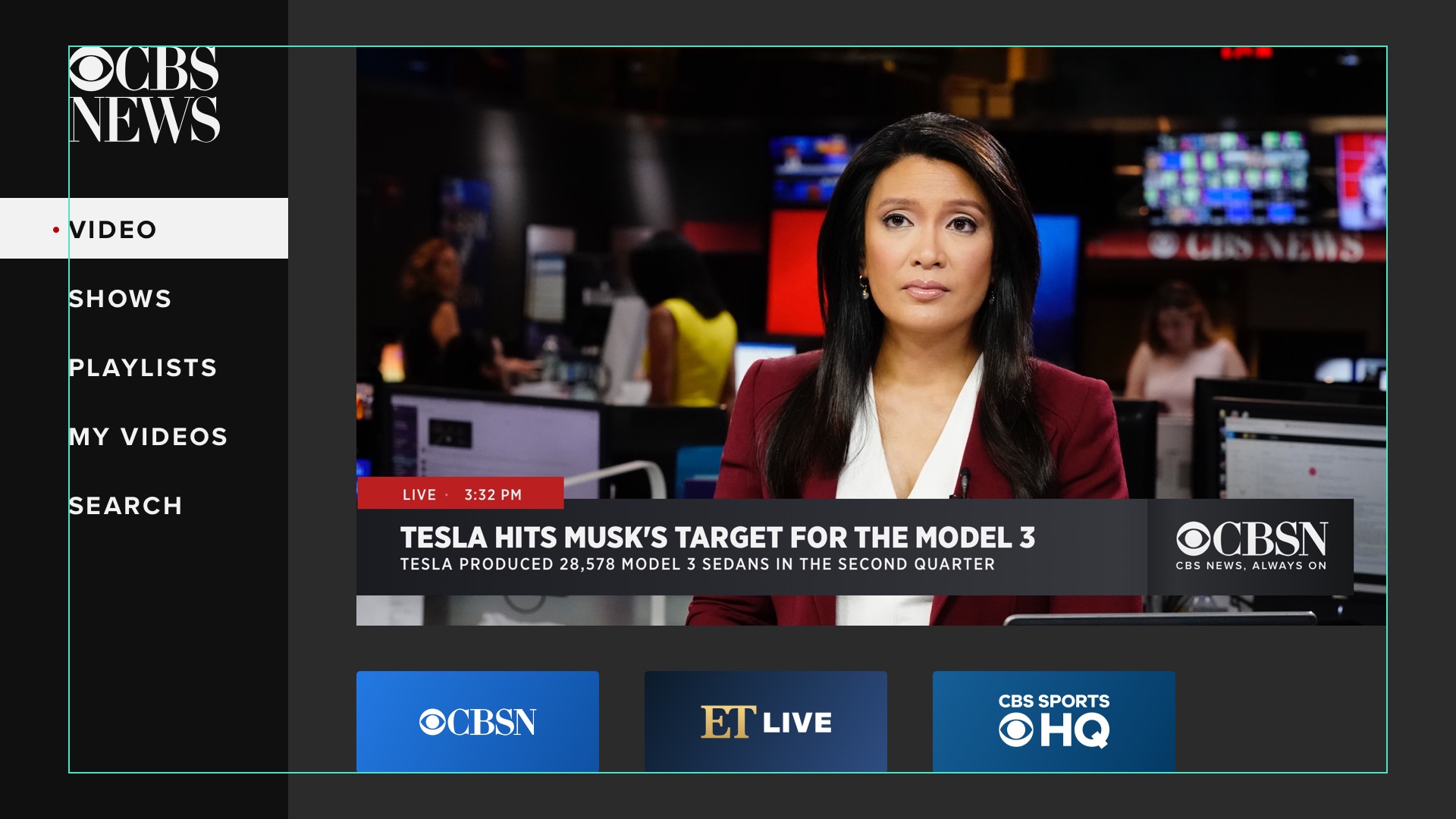
One of the first OTT app-related project I worked on was a refinement to original app, to which I had not previously contributed. Static mocks coudln't do the job, so I built an interactive prototype, shown in the screen recording below. Headers such as "Shows" and "Latest" would appear in a floating roundrec when navigating up and down using the remote.
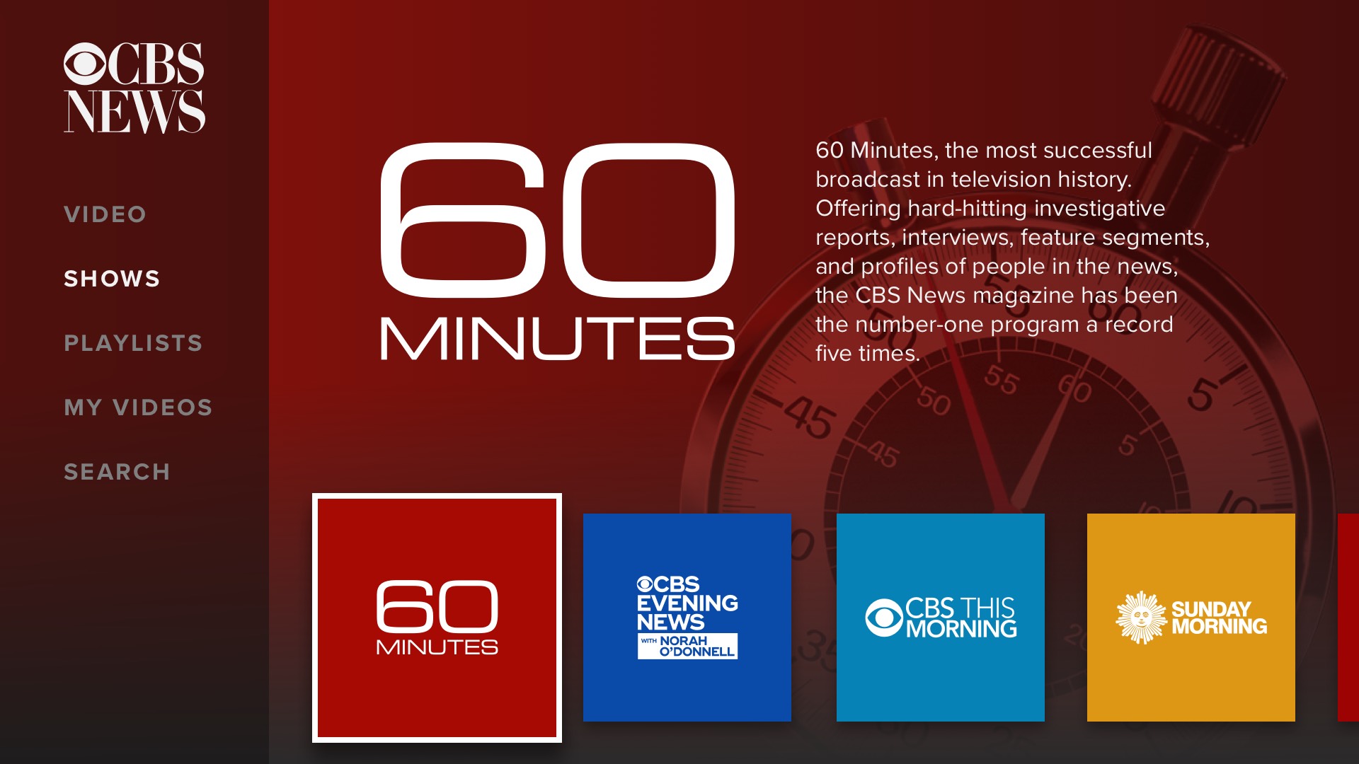
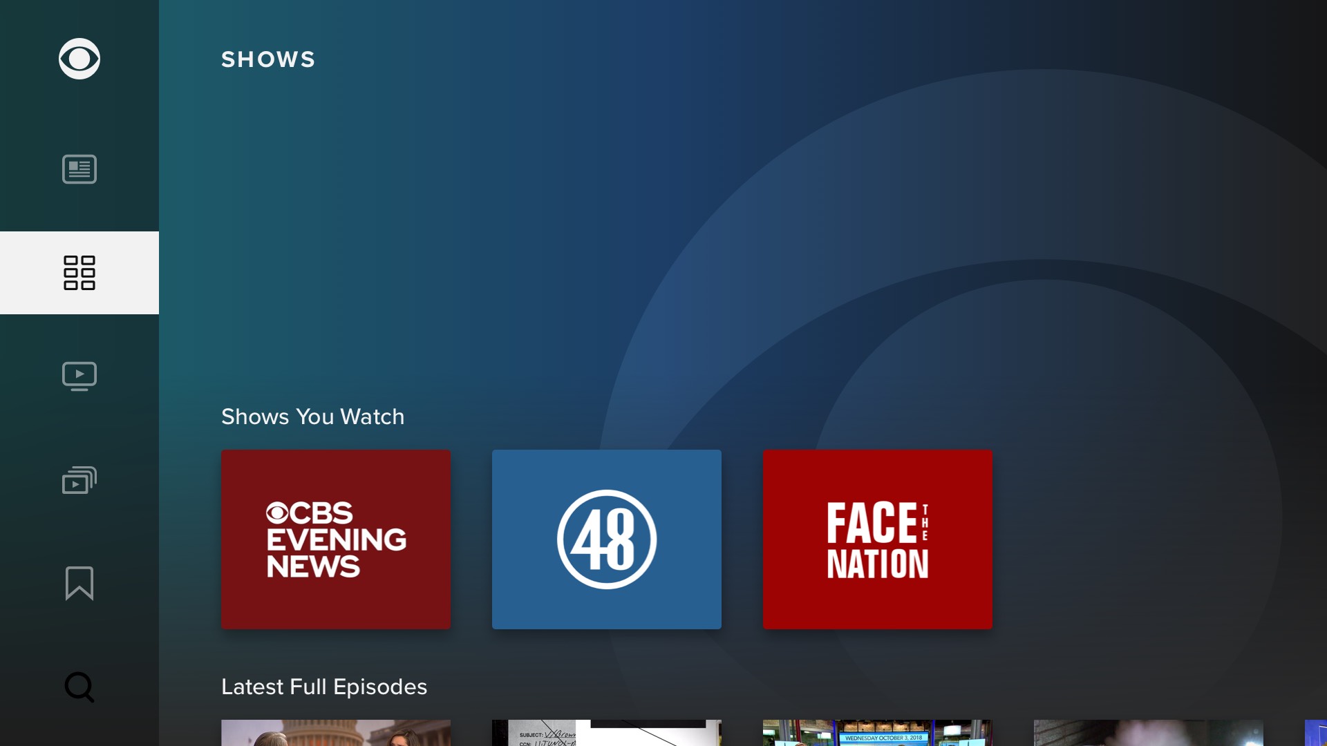
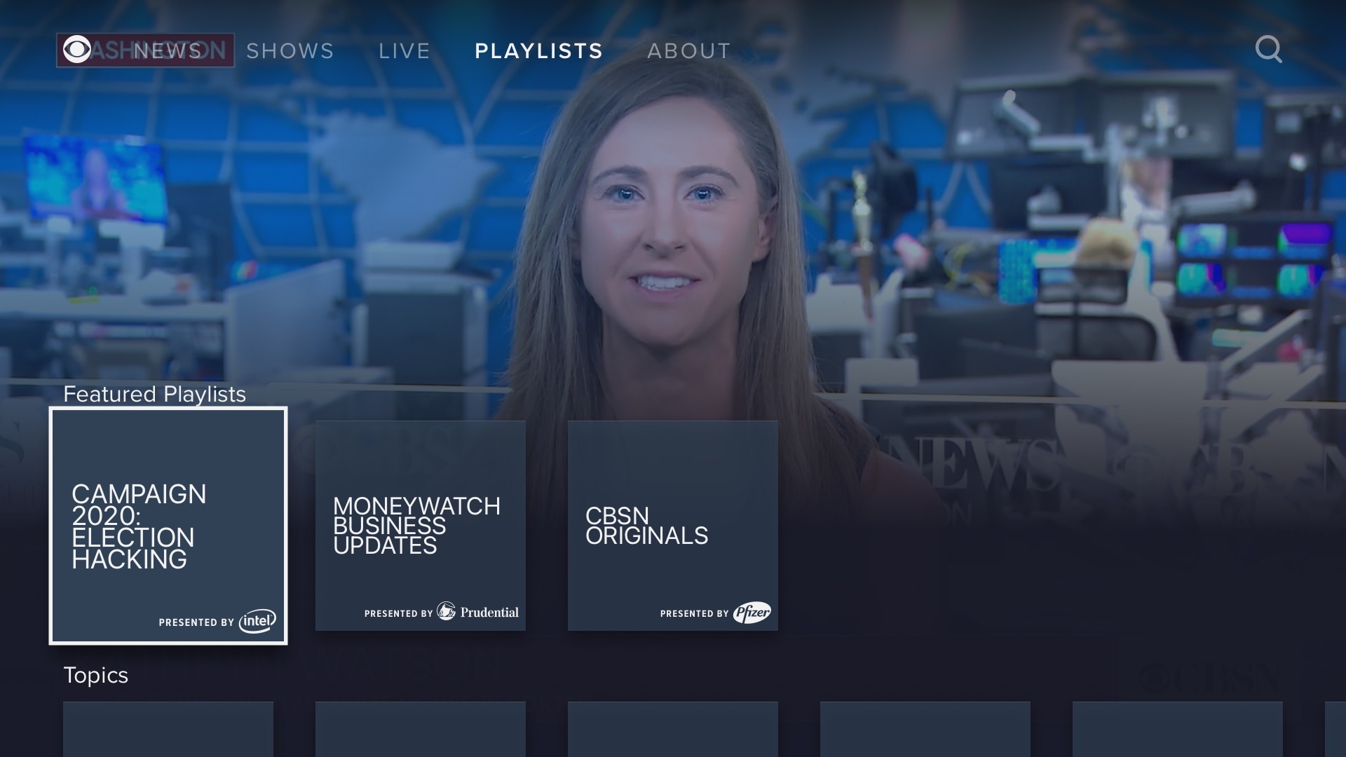
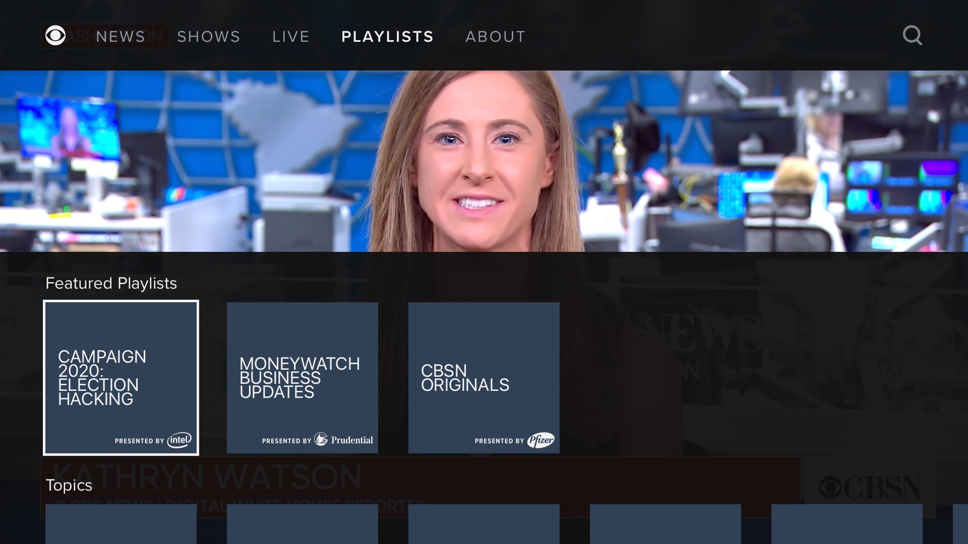
App Redesign
Circa 2019, I was the designer for a substantial redesign and relaunch of the OTT apps. This was a long and difficult process, for a number of reasons. For one, CBS News had apps on almost every available platform (tvOS, Roku, Amazon Fire, Xbox, etc.), all with varying constraints. For another, the Product person in charge of the project had a strong vision that the Creative Director did not believe in, and I was caught in the middle.
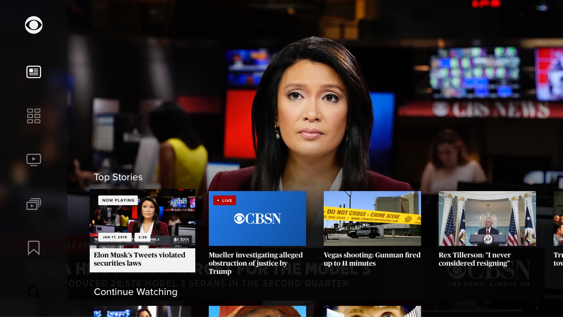
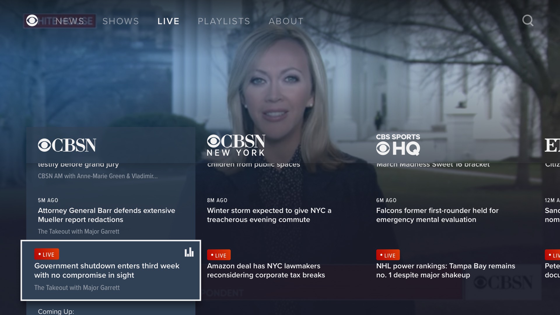
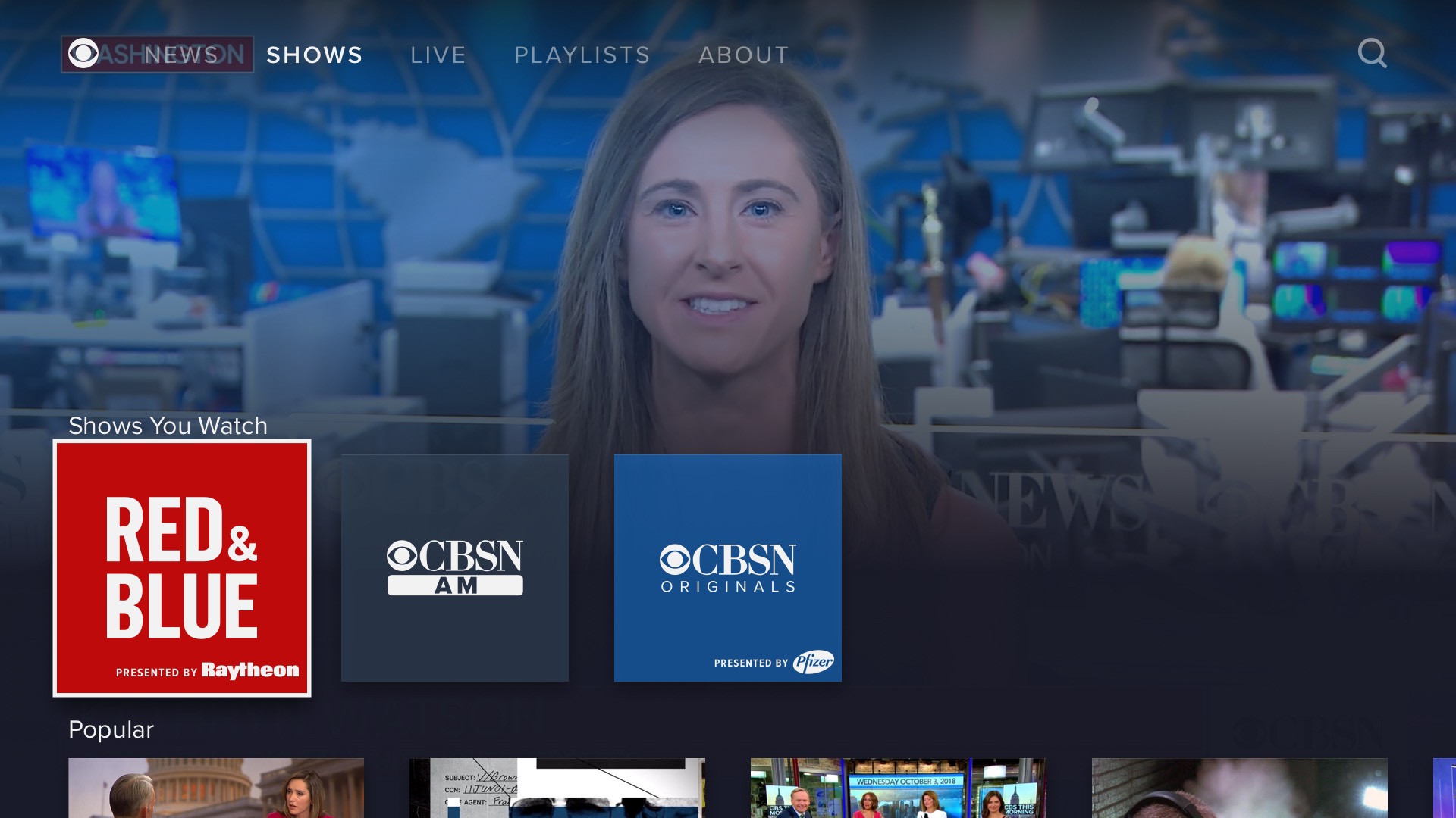
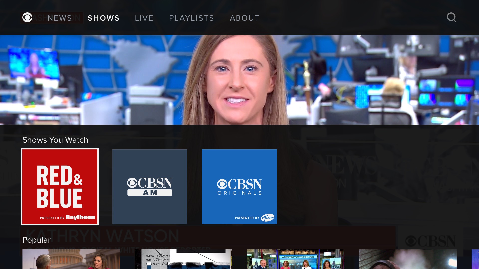
Her vision was to move away from the existing app model of a full-screen interface presenting an array of available livestreams, VOD segments, and playlists, of which the user moves in and out. Instead, the new app would always be playing something: the national livefeed immediately on launch. The interface would only cover approximately half the screen at any given time, and any selected content would replace the stream. Also explored but cut due to platform restrictions was the ability to play multiple feeds at once.
I would describe my role for this particular project as being far more UX than UI. We began the project working in "aspirational wireframes", meaning real content in loosely designed state, while exploring and evaluating features and functionality. I think my collagues may have gotten tired of me being the most vocal advocate for certain principles of TV design that I felt more strongly about than anyone else in the room, including:
- One single onscreen item is always focused. No exceptions.
- The focused item should be visibly apparent at first glance.
- Every item that may be focused must have an action associated with it, either triggered by coming into focus or being selected.
- Obey vendors' defined safe areas.
I should have printed some of these out as signs I could hold up during meetings.
Below are screenshots from the second iteration, during this early phase. These are pretty far from the finished version; it lacks the persistently playing fullscreen video feed.
Below are screenshots from the fifth iteration:
Below are the mockups from the seventh iteration. I think v5 above is more clear and even better looking. At this point, we were still pursuing a vertical navigation panel on the left, but the developer liaison from Apple to CBS News strongly advised against this.
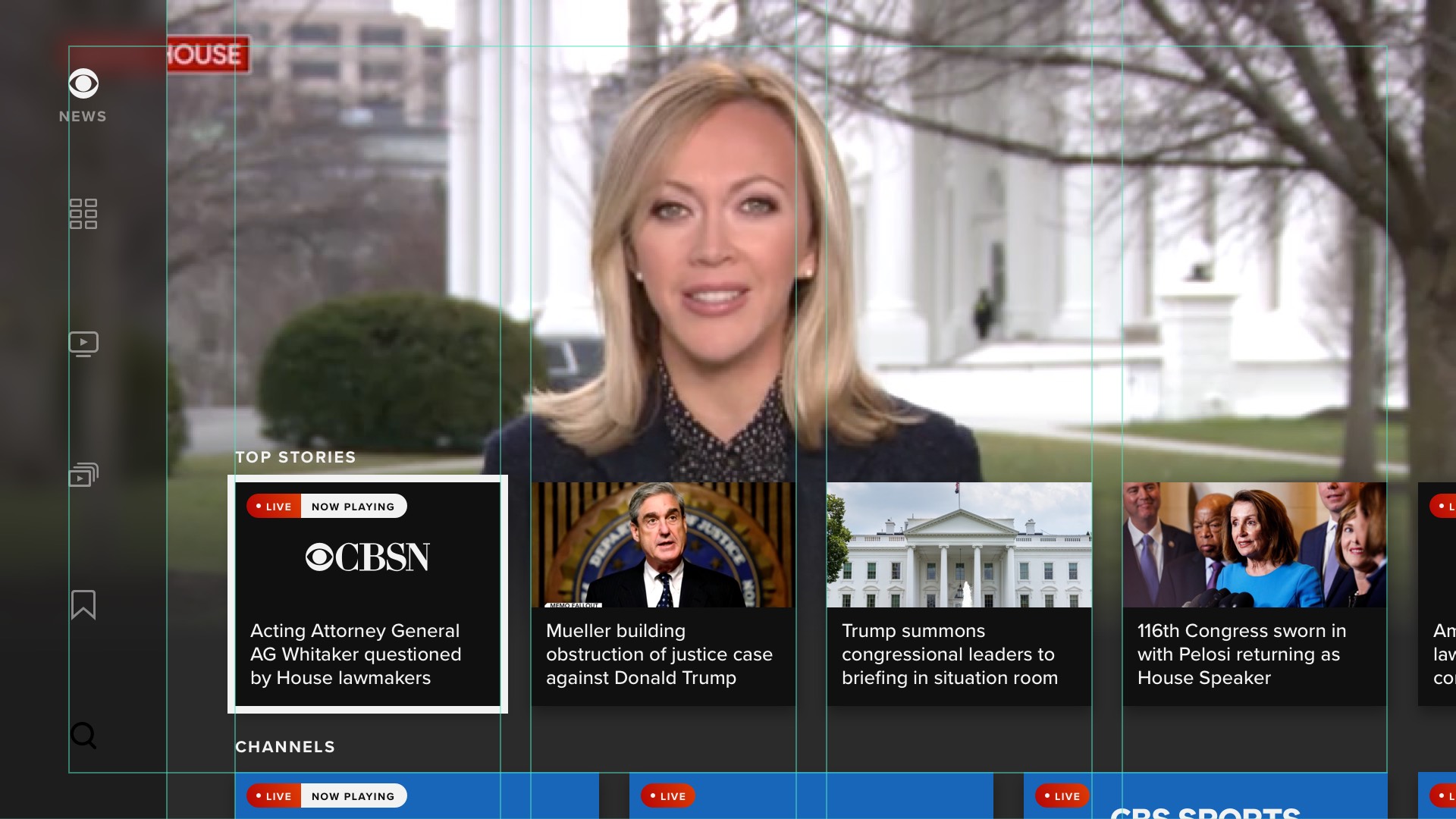
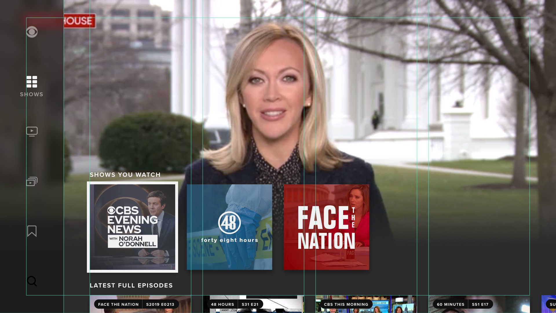
The Creative Director did not like what he was seeing, and created a UI treatment, which I had to work within on all subsequent explorations, shown below. We ultimately had to discard most of the Creative Director's work for platforms other than tvOS, which were not able to render elements like gradients, transitions, rounded corners, etc. The original plan had been a single design for all apps, but I wound up having to create and maintain two full sets of designs: one for tvOS, and another for everything else.
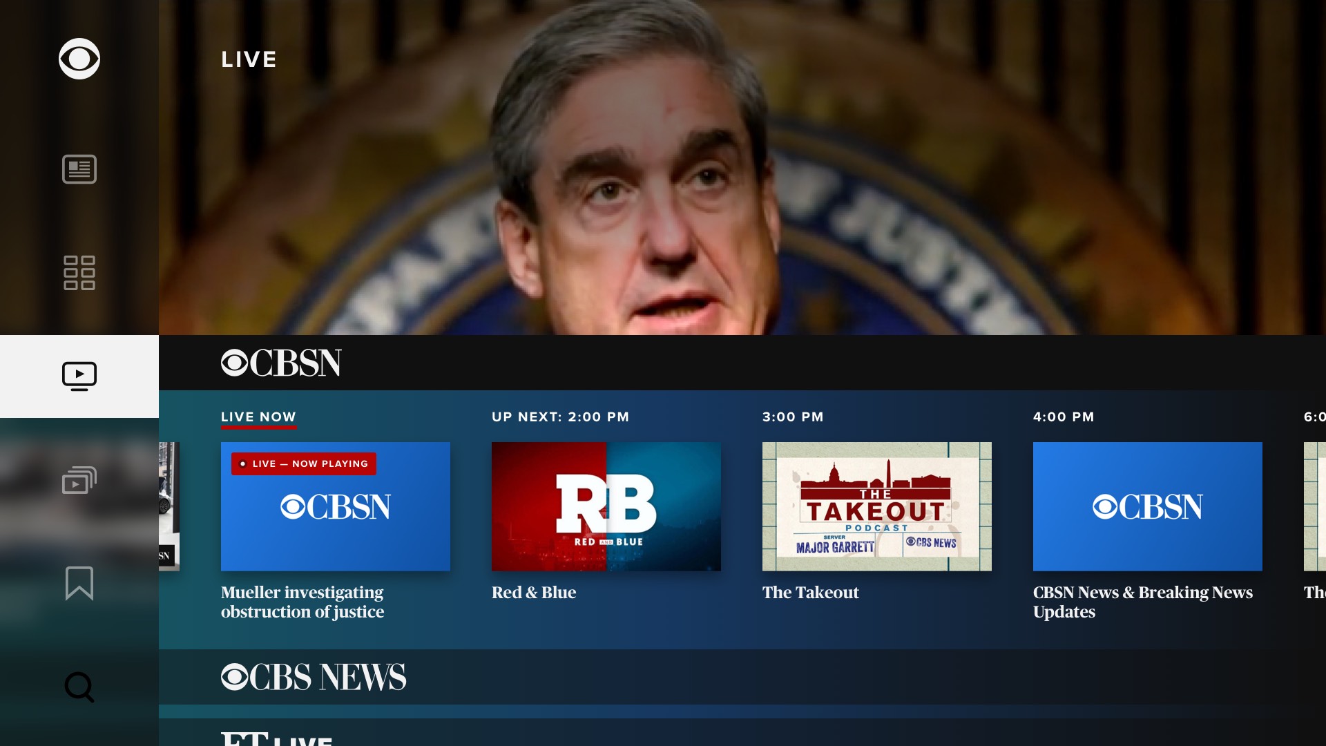
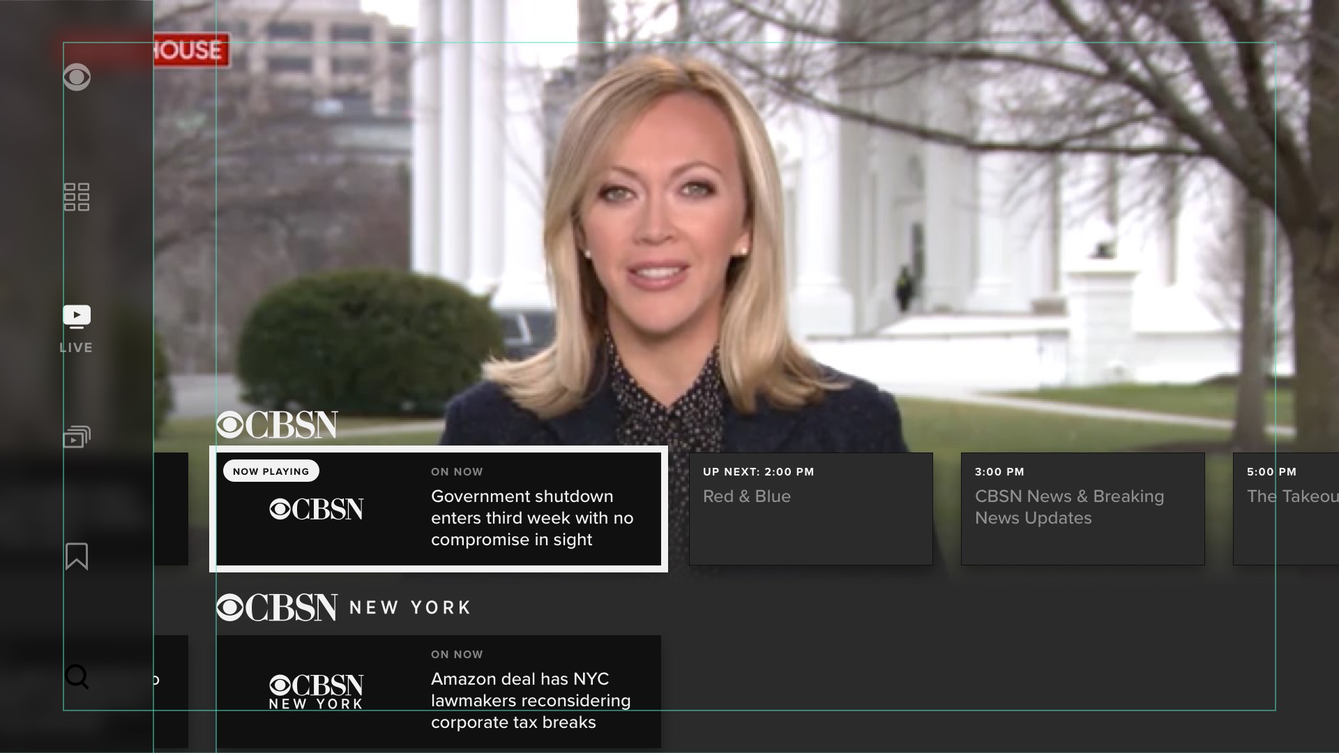
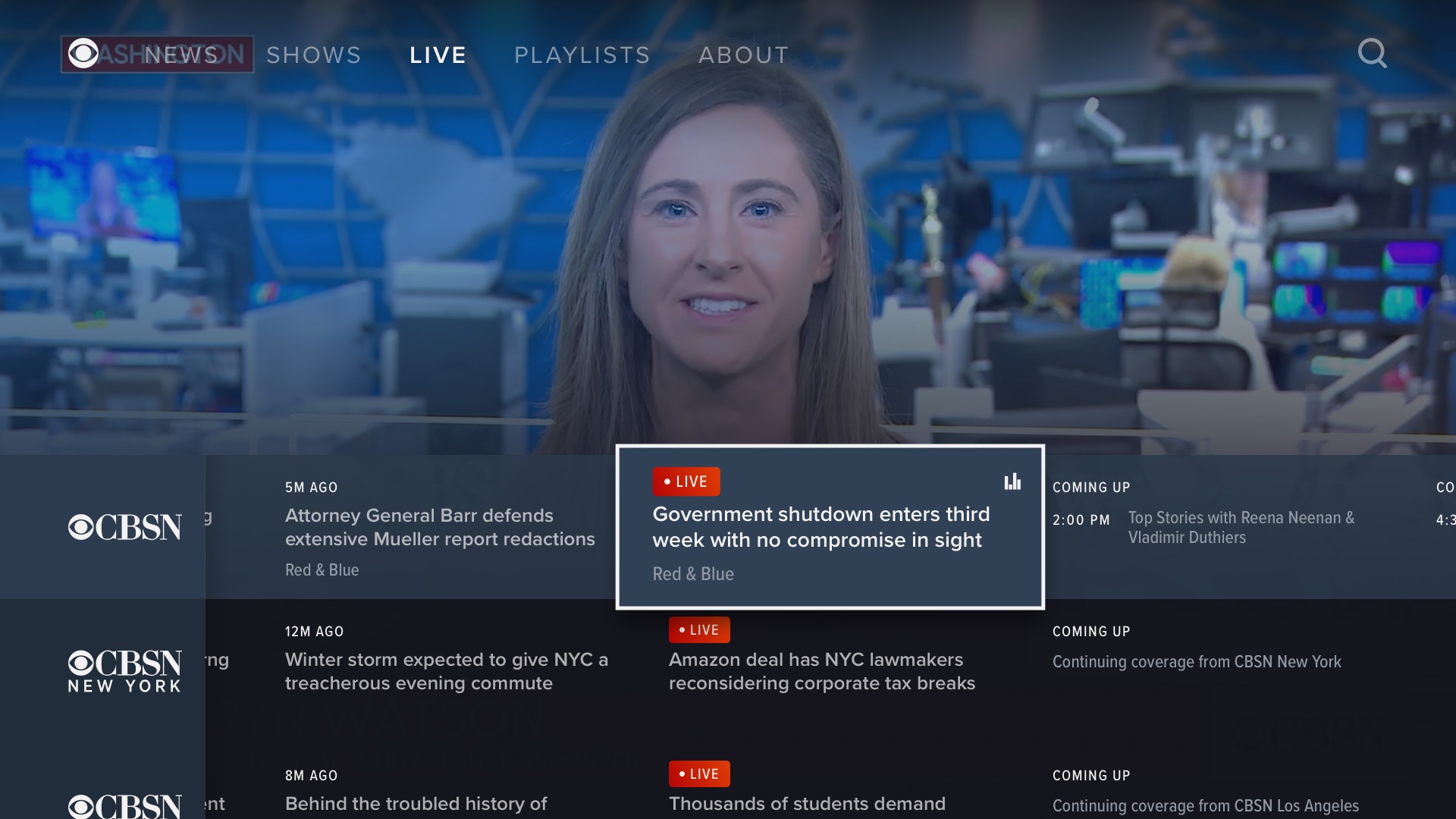
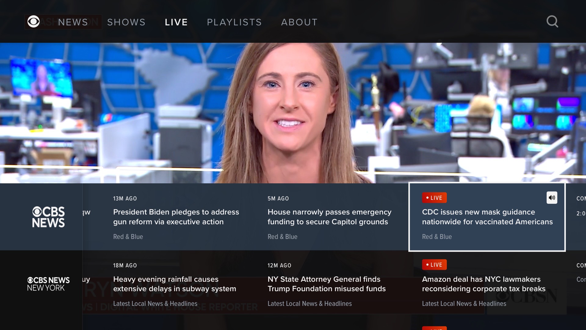
As was the case with the CBS News watch experience on web and app, the trickiest part of the app was the "Live" screen. Personally, I took to calling this feature as a faux-PG, not a true EPG. Below are some of the many early explorations:
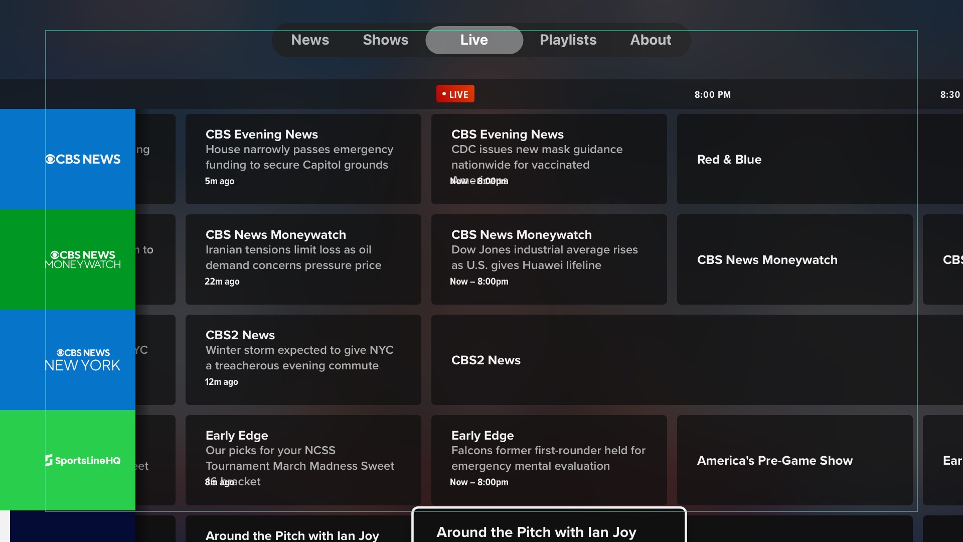
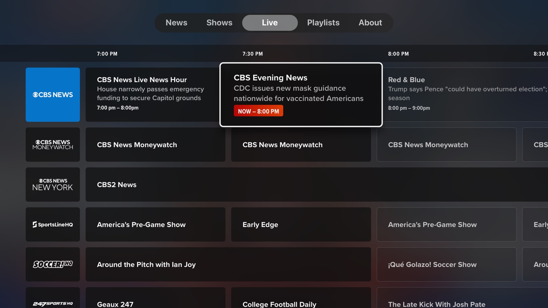
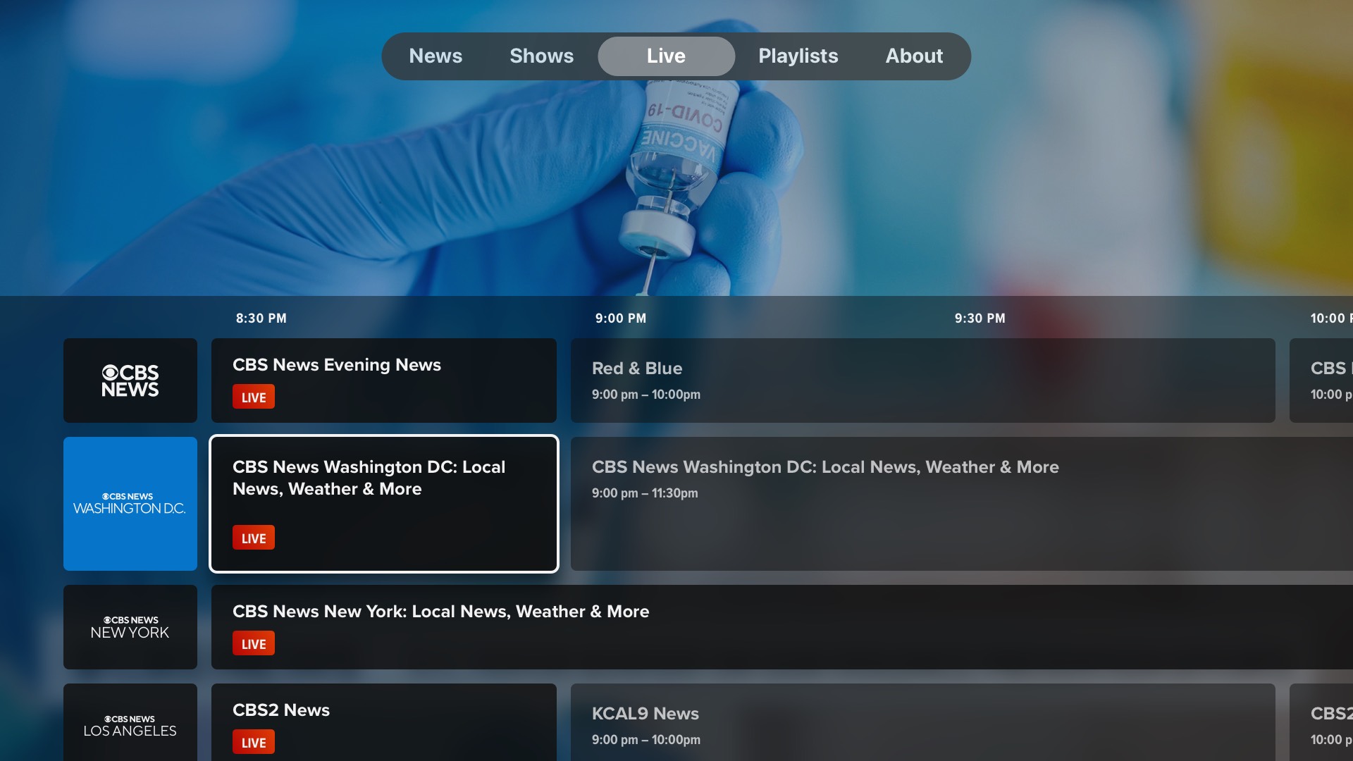
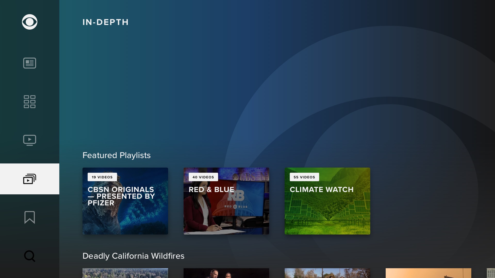
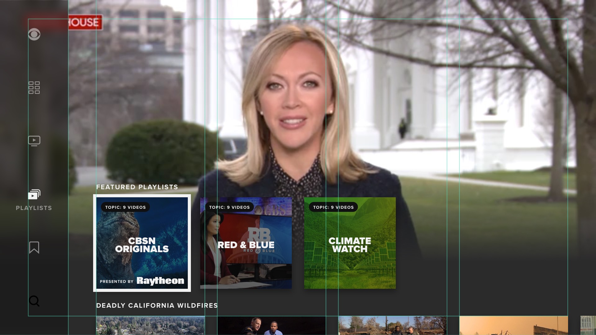
Below are final mockups of representative screens from the apps, shown side-by-side to illustrate the severe compromises made for certain platforms:
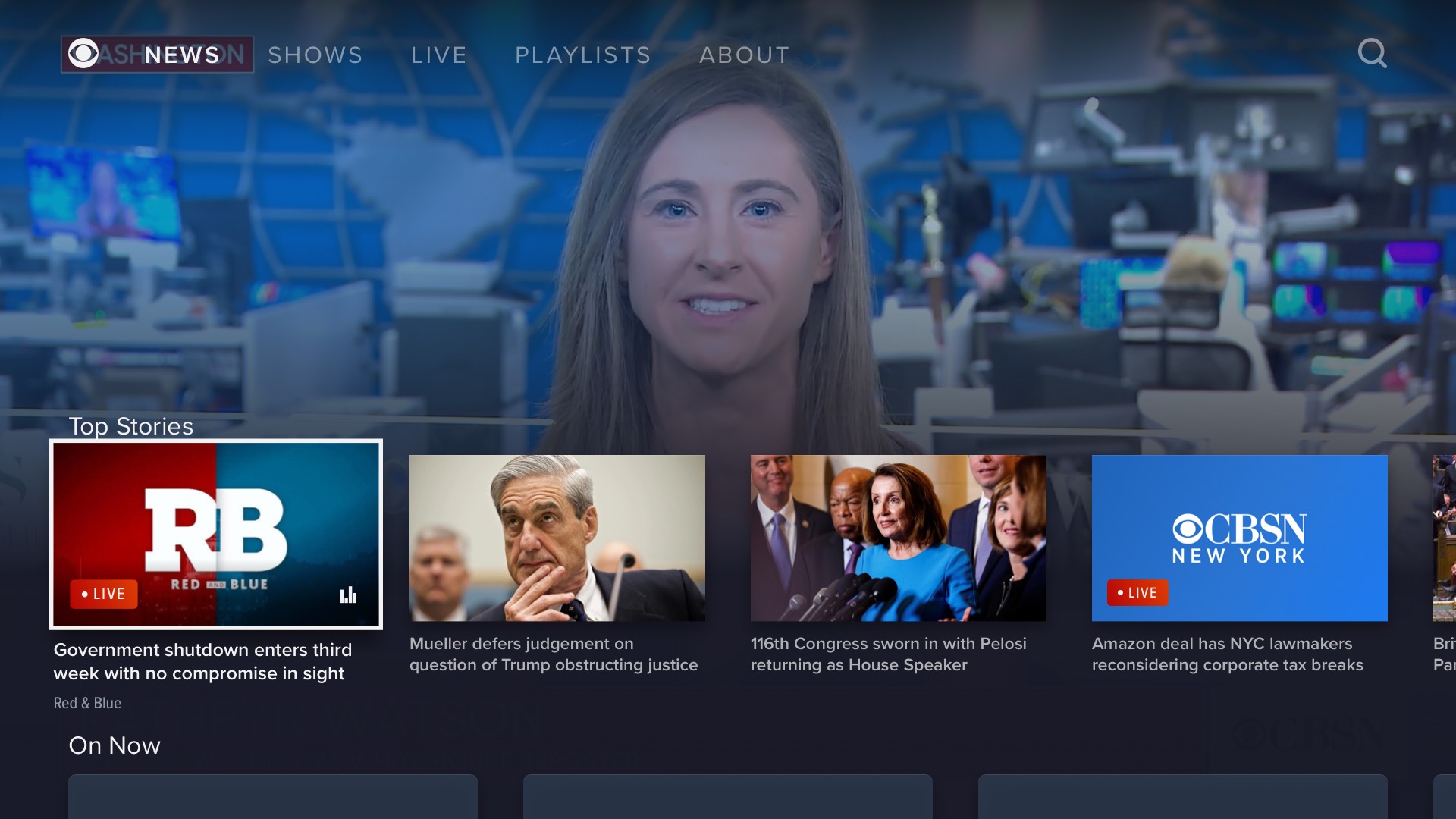
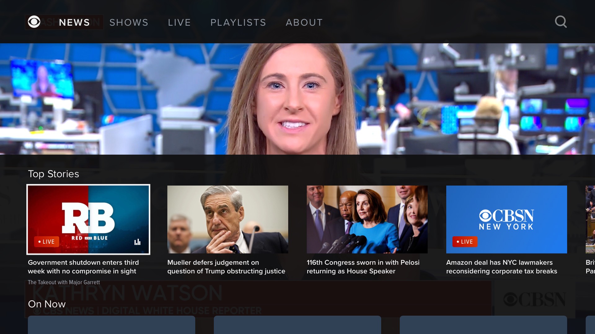
Below is a screen recording of the interactive prototype I built to showcase the redesign in internal presentations, made after the Create Director's UI treatment. The user could view it in any browser, and interact with it using the keyboard arrow keys to simulate a remote.
Below are some explorations for a feature I don't think we pursued: the currently-playing livestream or VOD segment or ad break could "push back" to reveal additional content, such as live updates, an in-house promo, or election results.
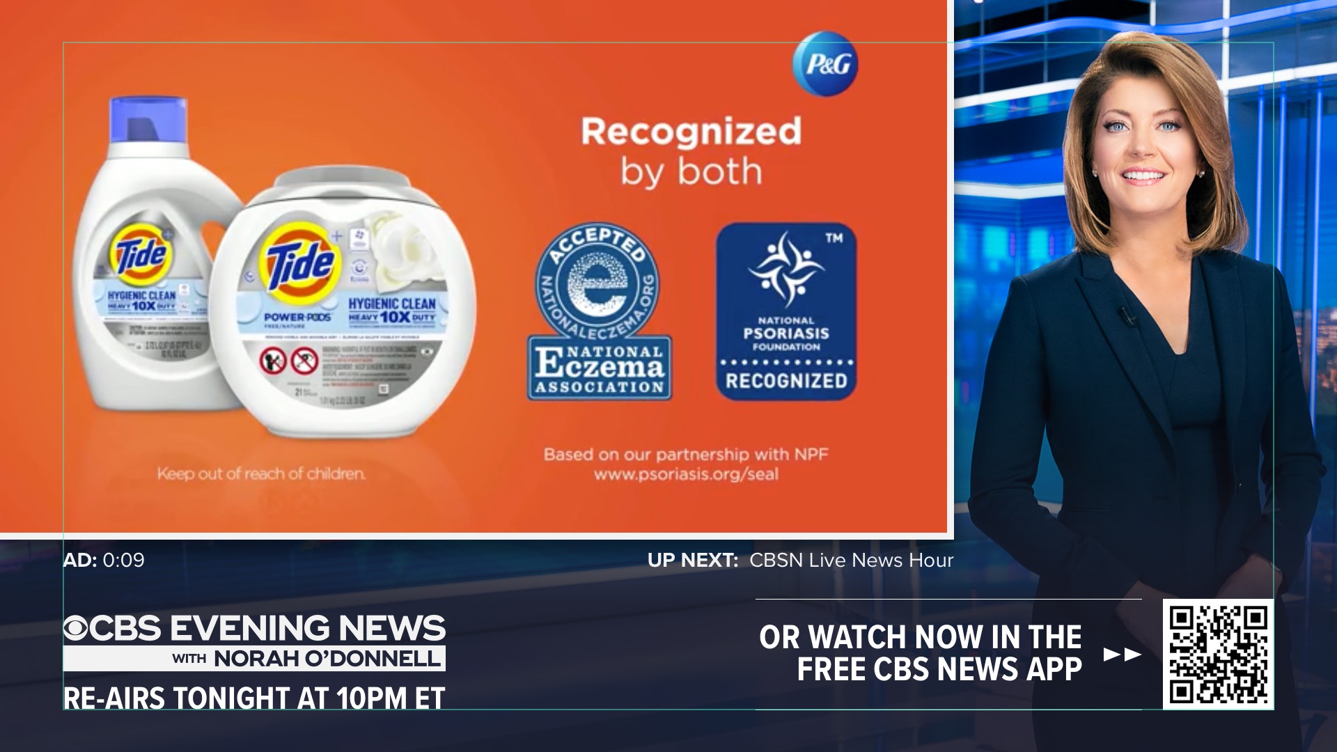
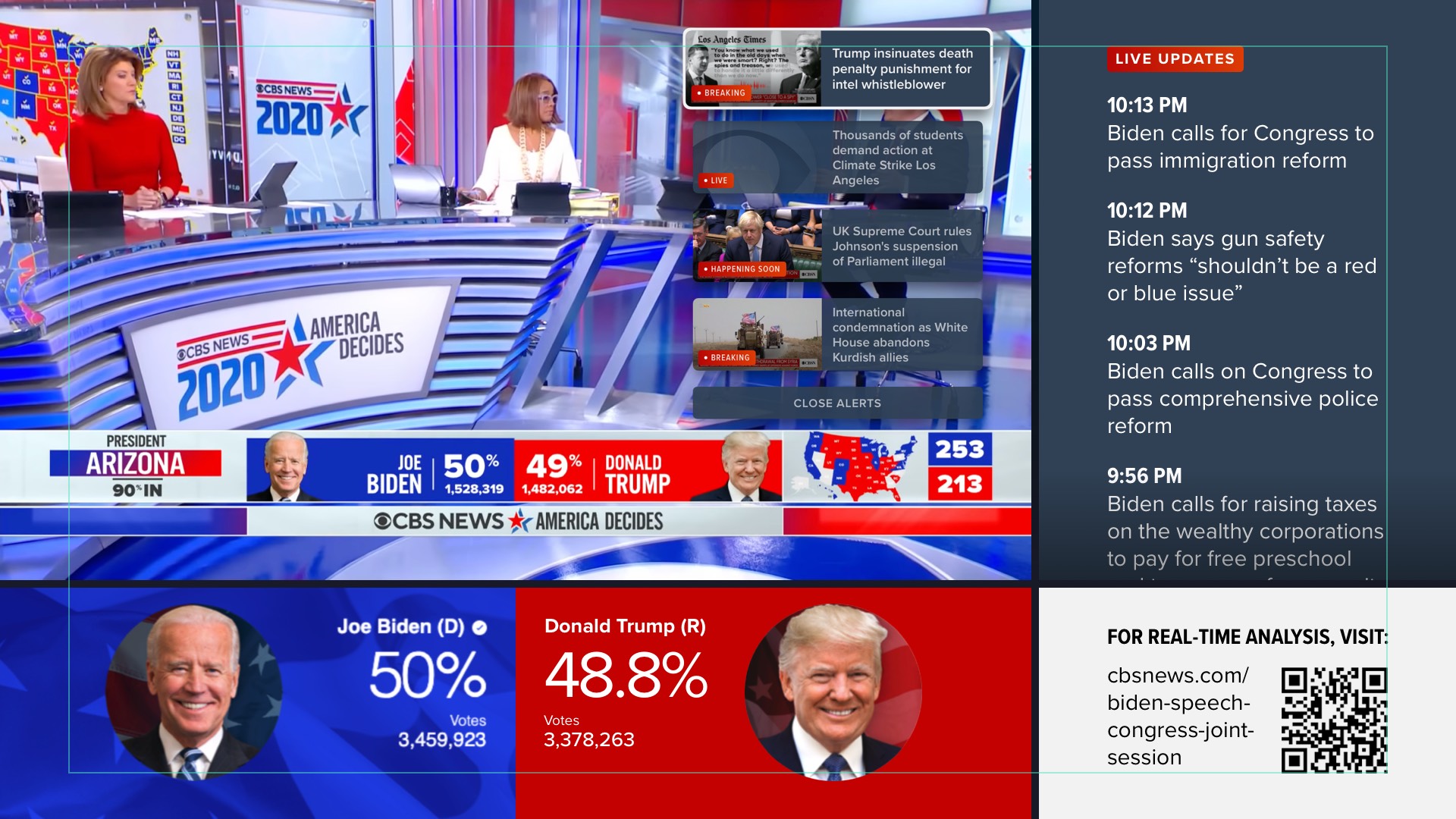
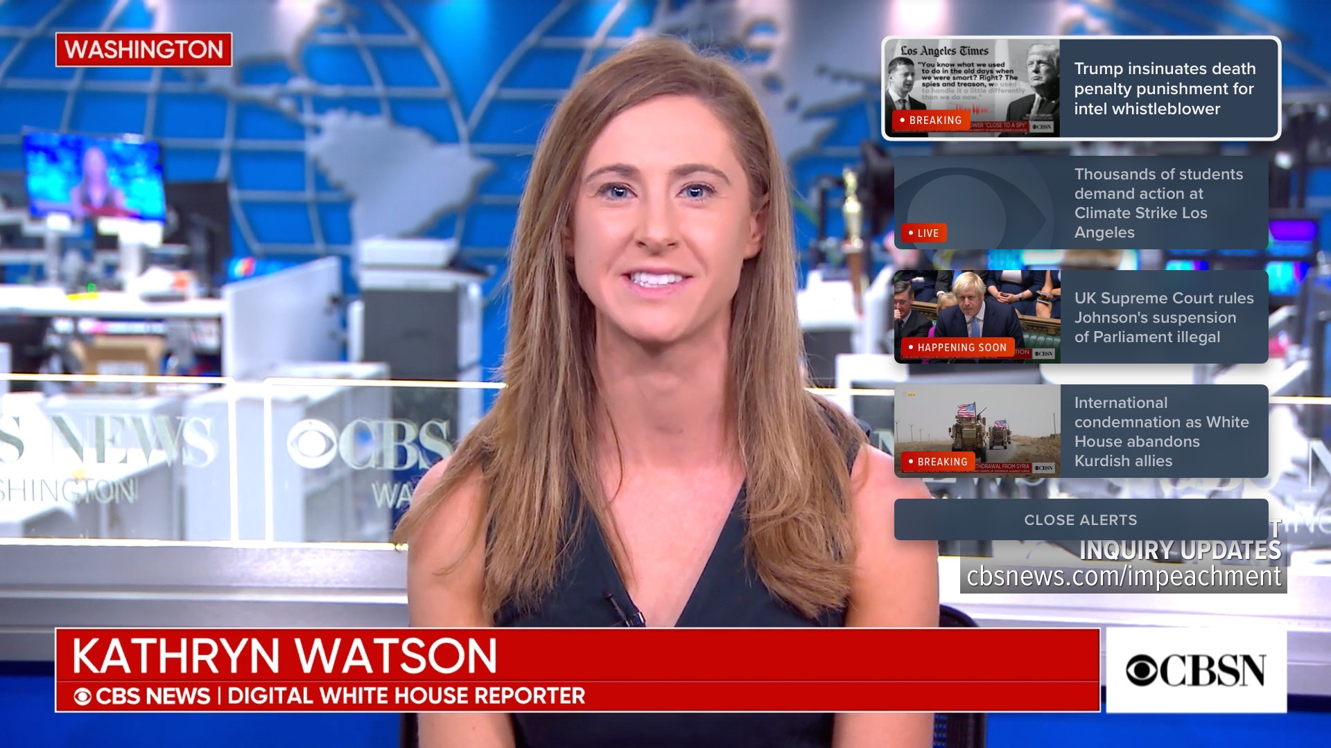
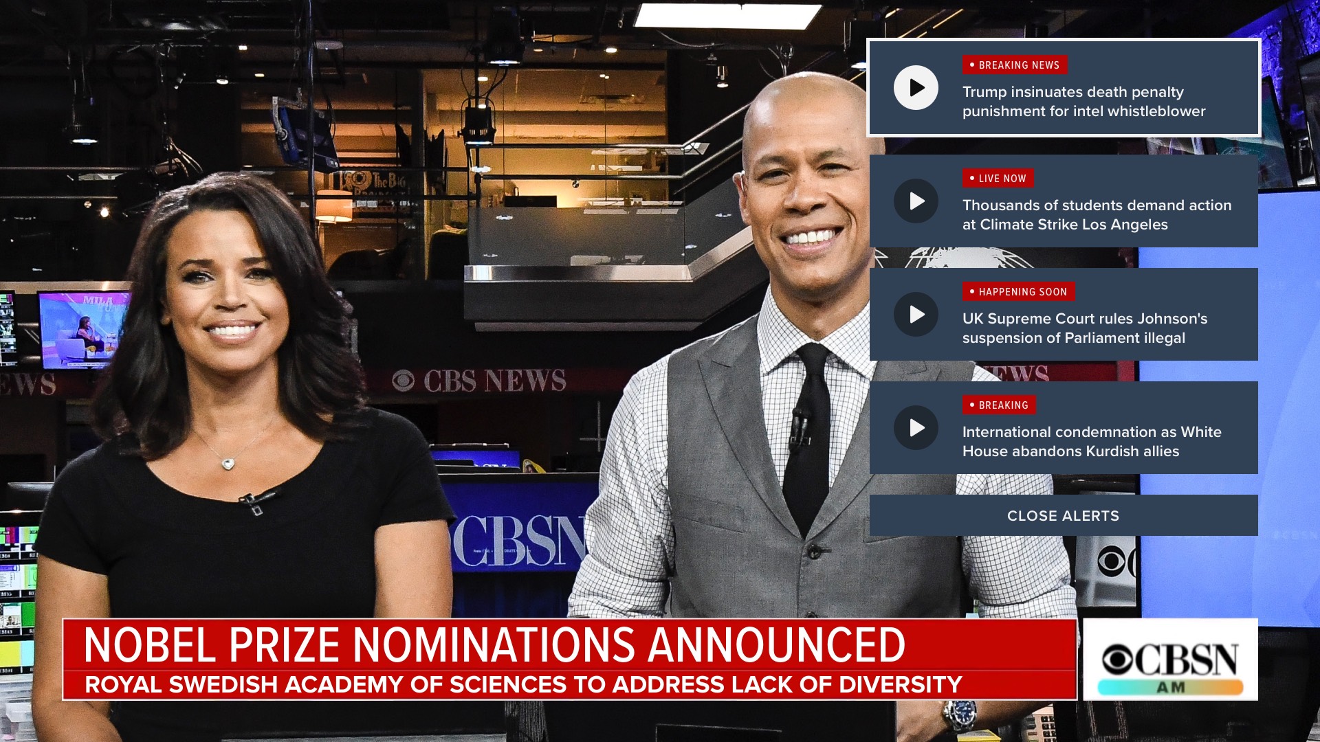
Video Push Alerts
After the 2019 redesign of the OTT apps launched, I continued to work with the same Product person on a new feature: Video Push Alerts. Here are static mocks of the final designs, one version for tvOS, and a more basic version for less-powerful systems like Roku:
Below are screen recordings of several prototypes I built for us to visualize and evaluate various VPA concepts.
This first is my own preferred interaction model, where a new alert would push back the currently-playing live feed or VOD clip, and the user could use the remote's arrow keys to select between the currently playing video or any of the available alerts. This would have been difficult but possible on high-powered Apple TV devices, but likely not on almost any other platform. Also, I don't recall anybody else other than me liking this.
The below prototype demonstrates a horizontal panel that is initiated by either a new alert being delivered, or the user manually clicking the left arrow on their remote (or swiping left on an Apple TV remote):
Below is a screen recording of the close-to-final version of the feature:
A quick variation of the above, exploring how it would look and work if it was tied to the remote's "up" button:
I also produced at least one non-interactive prototype, to demonstrate the delivery of a new alert, and the expiration of an existing one. Screen recording: